
Instagram changed its wordmark after 10 years, and legibility may be the price of personality
Instagram kept the script, cleaned up the letterforms and left the app icon alone. The result is more modern, but not necessarily easier to read.
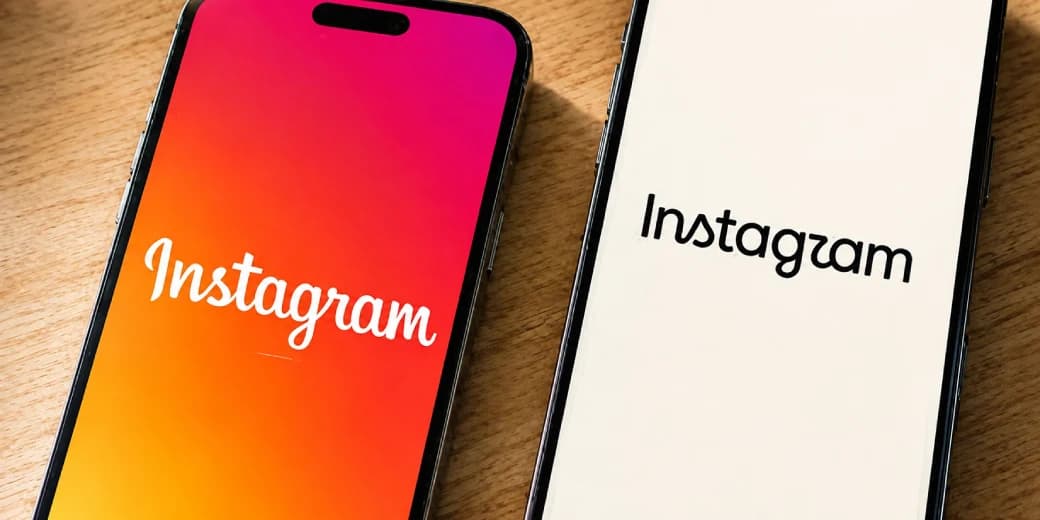
Instagram has changed the wordmark that appears at the top of its app for the first time in roughly a decade.
The app icon is not being replaced.
This is a typography change.
Instagram head Adam Mosseri described the new mark as cleaner and more modern while preserving references to the familiar script identity.
The result sits somewhere between cursive handwriting and a more constructed display typeface.
It is recognisably Instagram.
It is also exactly the kind of redesign that makes the internet spend an afternoon arguing about whether one letter suddenly looks wrong.
Why change a wordmark everyone already recognises?
The strongest argument against touching a famous logo is familiarity.
Millions of people already recognise it.
The strongest argument for changing it is that brands do not live in museums.
Instagram has changed enormously since the previous wordmark arrived.
The service is no longer mainly a square-photo application.
It is:
- Reels
- Stories
- Direct messaging
- Creator businesses
- Shopping
- Recommendations
- Broadcast channels
- Cultural discovery
A visual identity can gradually stop matching the product around it.
Instagram's design problem was therefore not "make something new."
It was "modernise this without making the brand feel newly invented."
That is harder than designing a logo from scratch.
What actually changed
The new wordmark preserves the script idea but simplifies the construction.
The strokes feel more controlled and less ornamental.
The forms are cleaner.
The overall mark sits more comfortably in a modern mobile interface.
That restraint matters because Instagram's visual ecosystem is already loud.
The gradient app icon carries enormous recognition.
The wordmark does not need to compete with it.
But simplification can create another problem.
Script lettering depends on recognisable joins and rhythm.
Change those relationships too far and a word becomes a shape the reader needs to decode.
That is where much of the criticism has focused.
The legibility debate is not trivial
Some viewers have joked that particular letter combinations are difficult to read.
That kind of reaction matters more than designers sometimes admit.
A wordmark has two jobs:
- Express a brand personality.
- Be read as the brand name.
The first job should not defeat the second.
Instagram has enough brand recognition that many users will identify the mark from context even when an individual letter feels ambiguous.
A smaller company would have less room for that luxury.
If a startup's customers cannot read the name, the logo is not mysterious.
It is underperforming.
Why Instagram kept the script
A geometric sans-serif wordmark would have been easier to read.
It also would have looked like a large portion of the technology industry.
Instagram's script carries history.
It connects the brand to an earlier period when photography, personal expression and handcrafted visual culture were more central to the service.
Preserving that cue gives the product warmth.
That becomes particularly useful as the feed itself becomes more algorithmic.
Typography is doing emotional work that the recommendation system cannot.
A header wordmark has unusual constraints
This mark is not primarily designed for a building facade.
It appears in a narrow area at the top of the app.
That means it must work:
- At small sizes
- On high-density screens
- In light and dark themes
- Beside interface icons
- Across a huge range of devices
The context helps explain the push toward cleaner construction.
The real test is not a giant press image.
It is what happens when the logo appears at phone size hundreds of millions of times.
Why users get emotional about tiny logo changes
People do not experience a major social platform as a neutral tool.
It becomes attached to .
Old logos are linked to particular years, friends, creators and versions of the internet.
When a platform changes one, the reaction is not always really about kerning.
Users can be responding to everything else that changed in the product:
- More recommendations
- More ads
- More video
- Less chronological control
- A different social culture
A new wordmark becomes a convenient object onto which people project the history of the platform.
Design changes carry product baggage whether the design team intended them to or not.
What other brands can learn
Instagram's refresh offers several useful lessons.
Do not redesign for novelty alone. There should be a product, interface or strategic reason.
Protect recognition. Instagram retained the overall script identity.
Test legibility beyond the design team. Something that feels obvious after months in Figma can feel strange to everyone else.
Expect nostalgia. A decade-old identity belongs partly to the audience.
Judge the system, not the screenshot. The real test is how the mark behaves inside the product.
The tecMAMBO take
The new Instagram wordmark is not a disaster.
It is also not an obvious improvement.
Its best quality is restraint.
Instagram modernised a familiar asset without erasing the visual history that made it recognisable.
Its weakest quality is the exact thing a wordmark should normally treat as sacred: immediate readability.
That tension makes the redesign interesting.
Good identity design does not always need to be universally liked.
It does need to make the brand easier to recognise, use and remember.
Instagram already owned recognition.
Now it needs to prove the new lettering did not spend some of that advantage for style.
Sources
Share this story
Enjoyed this? Share it with someone who'd appreciate it.
Ask MAMBO
Have a plain-English question about this topic? Send it in and we may answer it in a future guide.
Ask a questionRelated reading
WhatsApp Plus is official: what KSh 119 gets Kenyan users and what stays free
WhatsApp Plus is Meta's optional paid tier for personal WhatsApp Messenger. Kenyan users have seen pricing around KSh 119 a month, with extra chat pins, themes, icons, ringtones and stickers while core messaging remains free.
Meta Muse Image shows why public Instagram posts now need privacy settings
Meta's Muse Image rollout turned public Instagram content into AI prompt material by default. Here is what users, creators and brands should know before leaving settings untouched.

WhatsApp is adding usernames, and you can reserve yours now
WhatsApp username reservations are open before the full launch later in 2026, letting you claim a handle that can help people reach you without showing your phone number.